Pattern, scale, and viewing distance of Graphic Concrete
BY LENA WECKSTRÖM
06.11.2018
From afar, all humans basically look about the same; the closer you get, the more interesting details emerge, making us each unique. When you come really close, it’s not only about looks but also about a feeling. An emotional connection is formed. I dare say the same thing happens with Graphic Concrete! From afar, you see that there’s an image or a pattern. Come closer and you realize that the pattern and scale of graphics on concrete yield a tactile and inviting surface.
You think I’m exaggerating.
It’s true that I had never seen people running their hands over a facade ... before I started to work with graphic concrete. The first time I saw people actually place their hands on a finished wall, it struck me –– graphic concrete has the ability to emotionally involve us in the environment; it facilitates a connection!
There are various studies showing that connectedness with the environment we live in promotes overall good health and I truly believe in that.
(All right, it’s possible I went too far in comparing a human being to a precast concrete panel. Looked at another way, though, we do tend to want to use all our five senses as we interact with the world around us.)
When planning your graphic concrete pattern, think about viewing distance. Some surfaces will always be looked upon from afar, like a sound barrier along a freeway. Others will usually be looked at from up close; think pavers beneath our feet. Most commonly, though, the project will be looked upon from various distances; for example, the facade of a building.
People react to viewing distance effects
I love patterns or images that alter in appearance, depending on viewing distance.
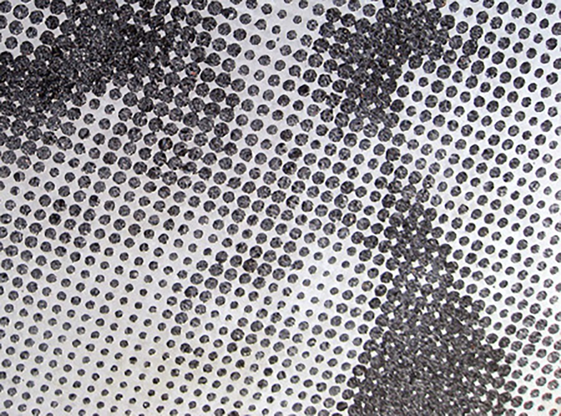
What comes to mind immediately is a pattern that looks like stripes from afar; up close, you find that very many smaller images make up the stripes.
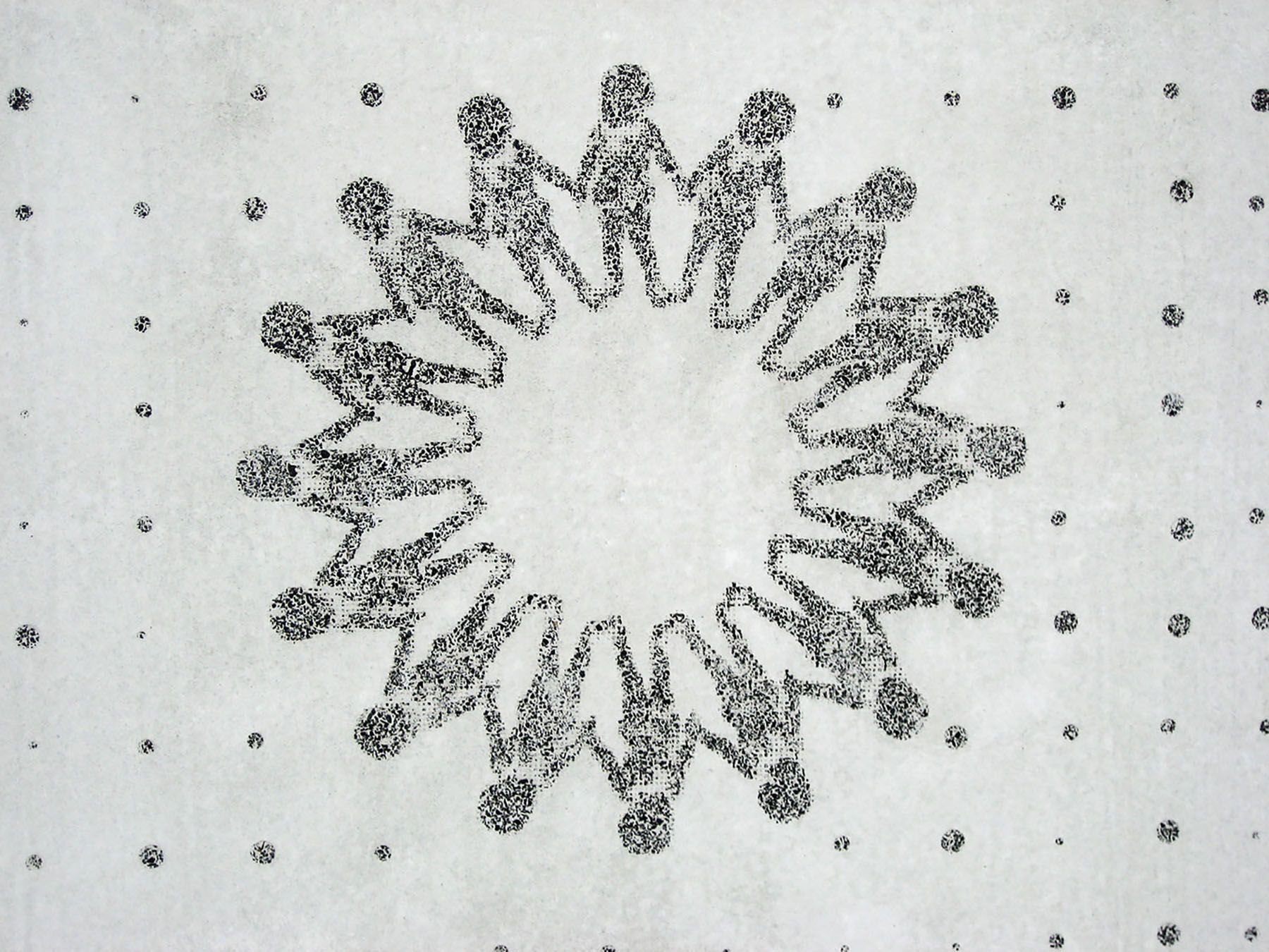
One of my favorites is a shopping center in Sweden where the images are made up of people holding hands. You can only see them when you draw near.


It works the other way, too. When standing close to the graphic concrete surface, you will experience the texture and the fine details. As you move further away, an image will suddenly appear (not unlike viewing an impressionist painting).


I love the fact that people tend to REACT to these things. Instead of walking by and hardly noticing, they stop, step back and forth, touch the beautiful concrete surface and maybe even start a discussion with other passersby.
Test your own design
If you are developing your own design, here are a few things to keep in mind:
- The computer screen will fool you.
- The bigger the better.
- Don´t make it too perfect.
The best way to test your design is to print it in a 1:1 scale; hang it up and step back. That way, you’ll get a real feel for the overall look and detailing.
Staring at your computer screen just doesn’t work; meanwhile, the printing method is surprisingly accurate.
For line weight, you should not go below 5 mm (approx. 0.2 inches). A thin line will show when looking close up, but it will add a blurry feel to the design from a distance.
The wider the lines or larger the pixels, the more contrast (meaning “depth”) your design will have.
I usually work with lines and pixels that are approximately 10 mm (0.4 inches). They might feel quite large from close up, but as you move away, you will notice that it works.
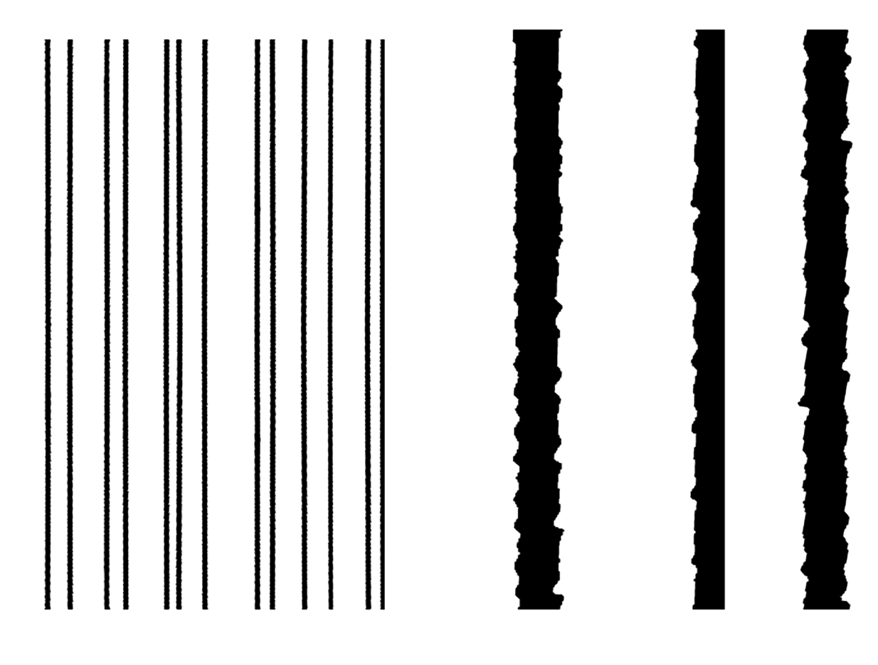
As for the type of line or pixels/dots, here’s what I mean by “don't make it too perfect”: A perfect pattern can be pretty boring. For example, in the line pattern below, both look the same from afar. Up close, however, the “hand-drawn” line is definitely more interesting.


Interested in learning more? Download our design instructions.